|
Ribbons |

|

|
|
|
Ribbons |

|

|
Ribbons
The program offers a design based on the guidelines of the „Microsoft Fluent UI“. The so-called ribbons were first implemented by Microsoft in Office 2007. The ribbon, also called a „band“, is a graphical display concept which combines the elements of menus and icons. This concept offers many advantages when using a complex program.
Note: According to the mode you are in, different ribbons are displayed. You can be sure that the choice of ribbons is suited to the area you are in.

This means the end of the days in which users had to click through levels of menus and submenus to find functions. Instead of this simple icons are displayed for the program functions depending on the context the program is currently in. In the window’s header words are listed – just as in traditional menus – which represent groups of commands, such as „Start“, „Insert“ or „Board“.
However, clicking on a word doesn’t open a menu, it opens a list of icons that represent the relevant commands. Each „menu“ has its own list of icons.
The ribbon takes up more room on the screen than the classical combination of menus and icons. The symbols are grouped within the ribbon depending on the monitor’s resolution and the size of the window. Since additional commands can be added to the ribbons it is rarely necessary to use dialog boxes. There is also the possibility to minimize the ribbons. This is done by right clicking on the ribbon and clicking on „Minimize the ribbon“.
This leaves the command words on the screen, but removes the icon list until they are clicked.
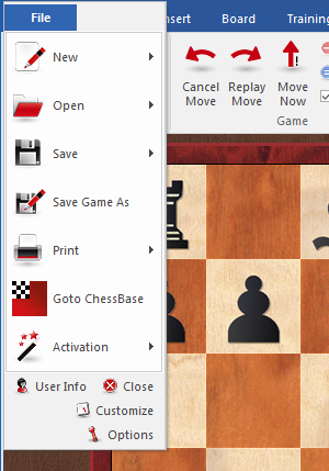
A very important function in this user concept is the File menu.

This menu is used to change important settings and access central functions of the program, such as the options dialog.
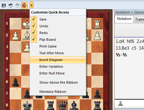
A further important component is the toolbar next to the user menu icon. These icons are used to quickly access commonly used functions with a single mouse click.

The user can decide whether the quick access toolbar is displayed at the top of the program window or below the ribbon. This option is selected by right clicking on the toolbar.
„Add to Quick Access Toolbar“ allows the user to customise the environment by adding the functions he uses most often to the quick access toolbar.
This user concept offers many advantages in day-to-day work with the program. For instance, many commands can be carried out easily. such as board selection or offers on the chess server. Since the functions are ordered based on how often they are used the operation is quicker and easier.
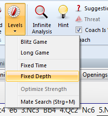
When working with the program the user should always check if an item is followed by a small arrow.

If this is the case it means that more functions are available.

This example shows the selection of the different 3D views. Clicking on the small arrow opens a submenu with additional functions.
Using the ribbons makes it much easier to operate the program. It is true that the new user concept requires the user to adapt himself if he was used to the old menu structure. However, the new user concept is much simpler and many functions are easier to access.